Sector
Public
Municipality
Services
Brand identity
Type design
Design system
Public
Municipality
Brand identity
Type design
Design system
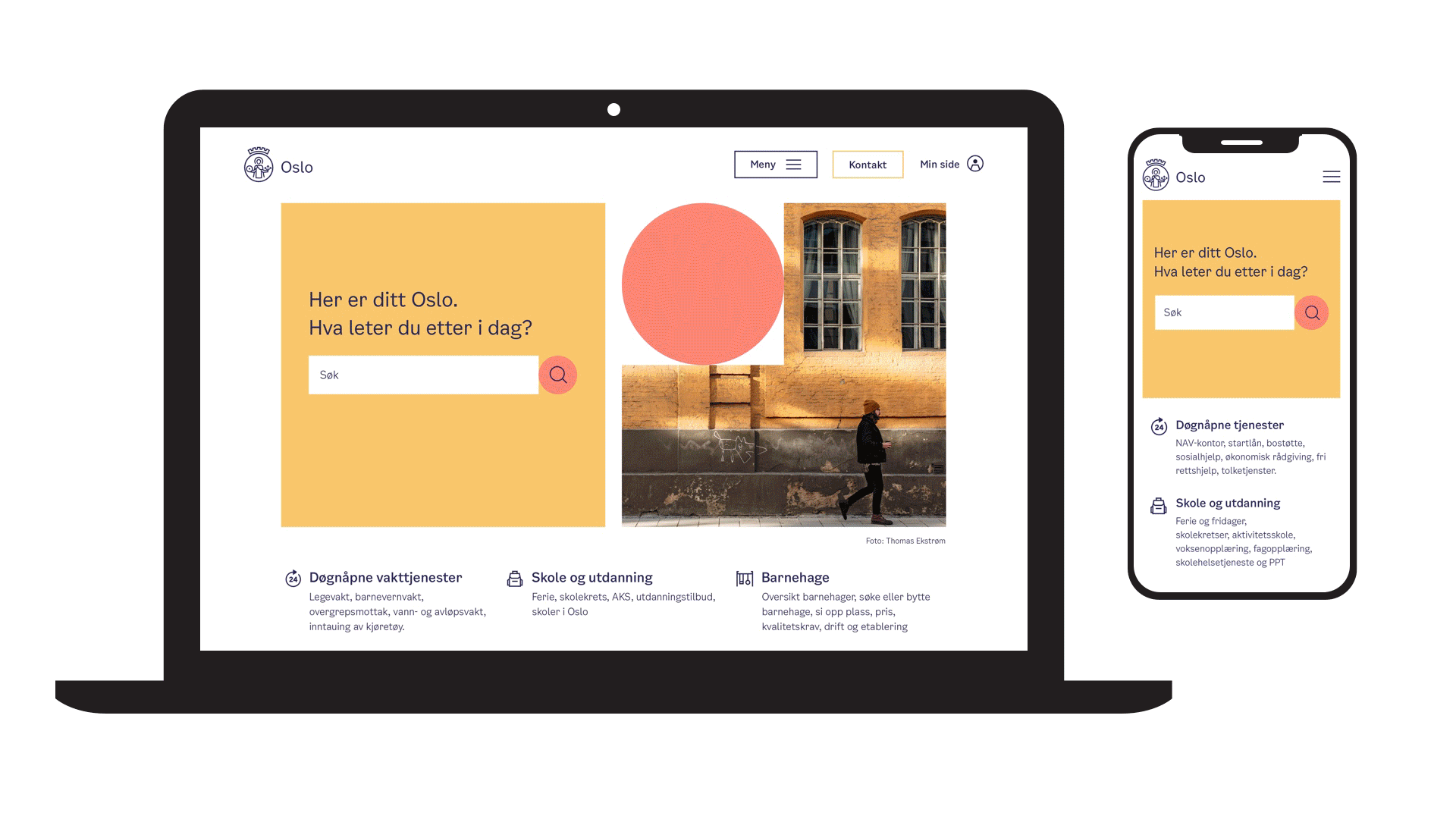
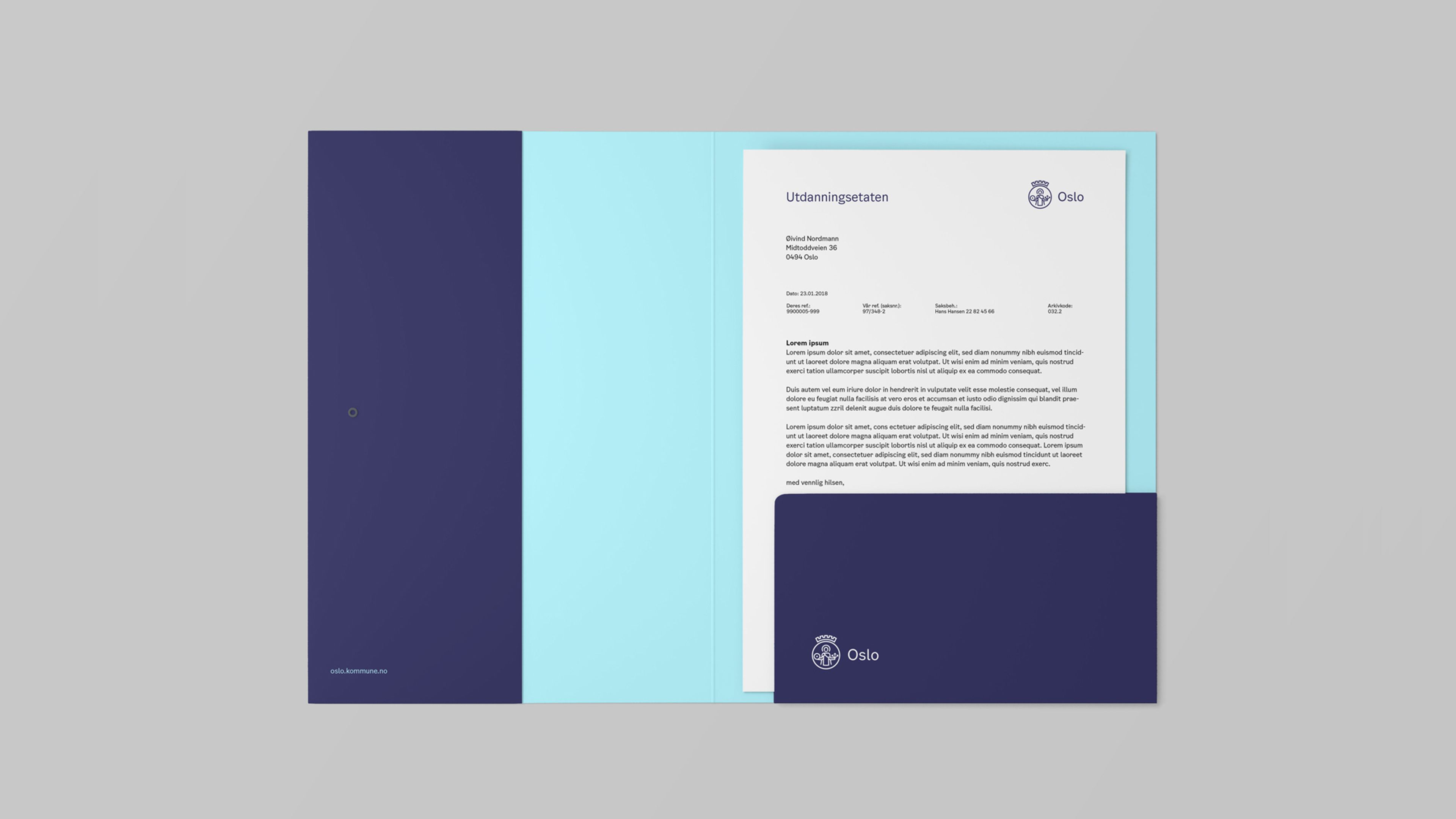
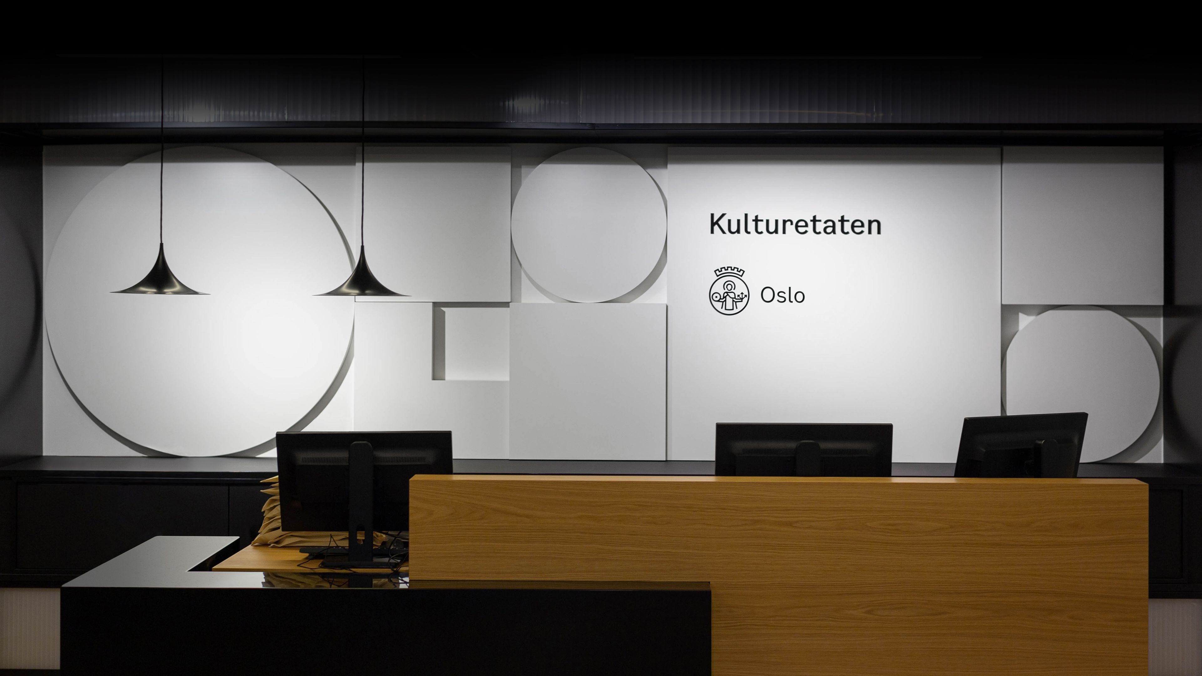
The City of Oslo and Creuna, now part of the Knowit Experience family, have developed a new, user-friendly identity that will make it easier for the Oslo municipality to communicate clearly and holistically with its residents. We developed a whole new design system, customisable with its' own font, shapes, colour palette and illustrations, available to everyone working in municipal services.
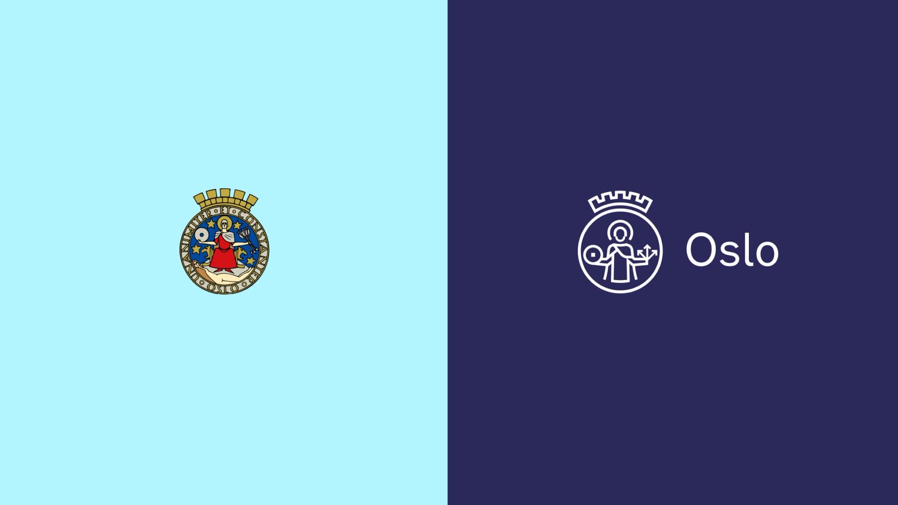
Oslo is a completely transformed city compared to 30 years ago – but the municipality’s identity stayed the same, fragmented and scattered across their jurisdiction with a logo from 1924. The city operates various services that communicate with different target groups, with more than 250 variations of the logo in use. Together with Creuna, The City of Oslo developed a new, visually recognisable and user-friendly identity.
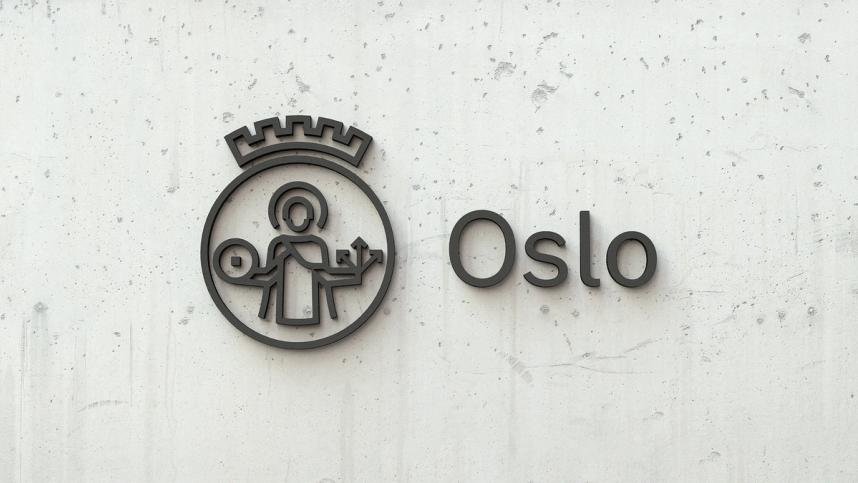
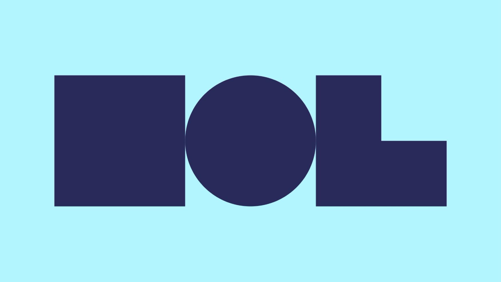
The new City of Oslo logo is based on Oslo's current city seal, designed in 1924. The representative drawing of St. Hallvard is simplified and modernised but still carries the same iconic story. The line weight and details were designed to work in all sizes – from smartphones to big signs.
More than 1,500 residents, representatives of the business community and large parts of Oslo's municipal enterprises were included in the work process. In several rounds, different groups considered the proposals in all stages, with other alternatives. Various solutions were tested along the way.
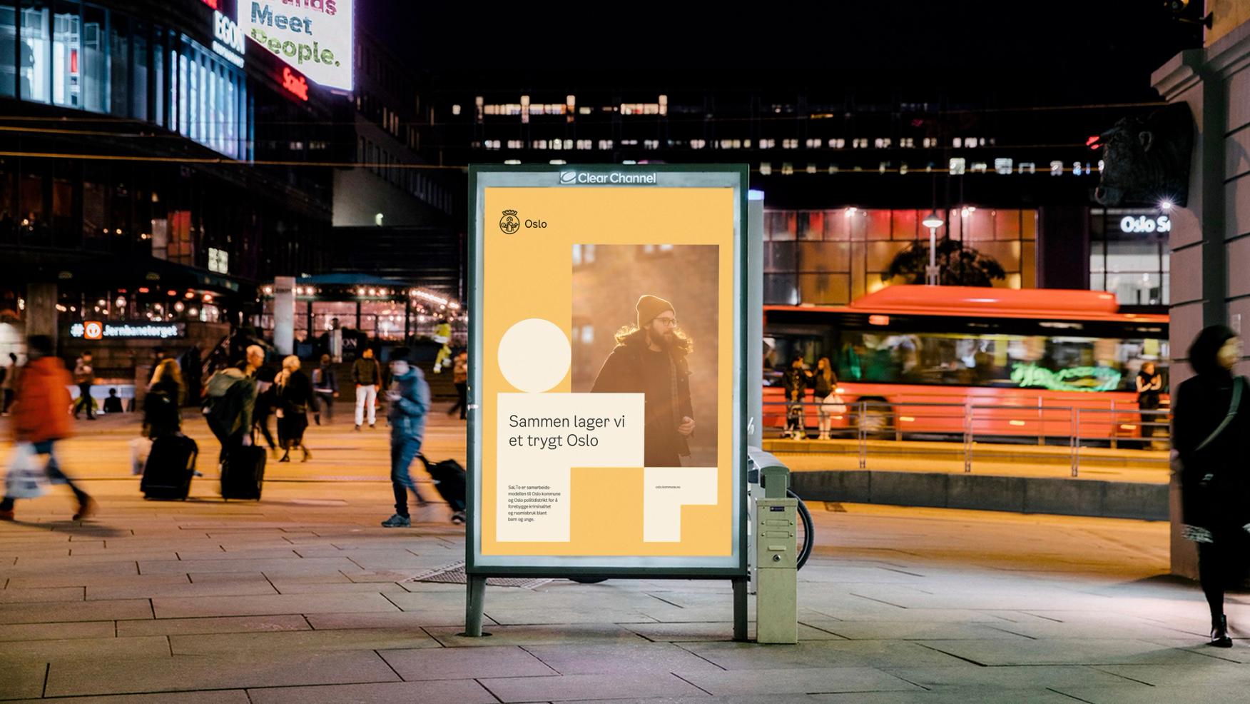
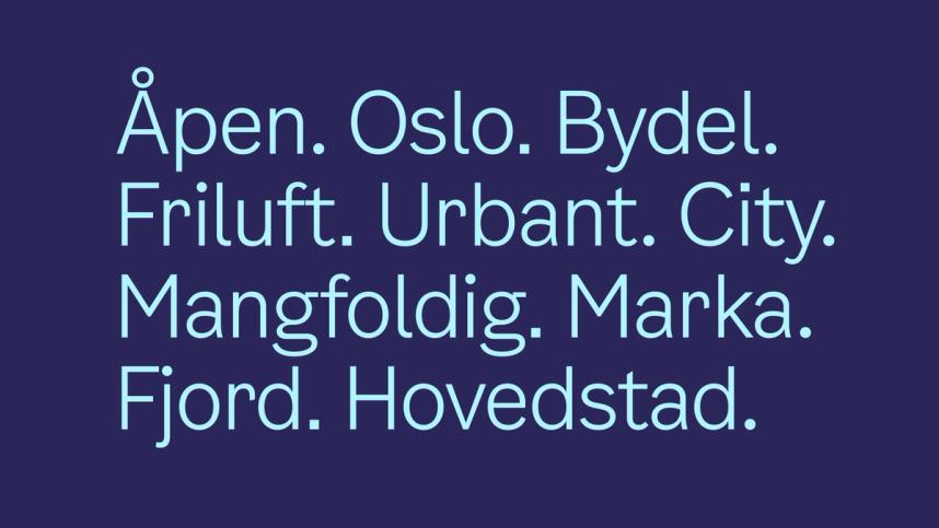
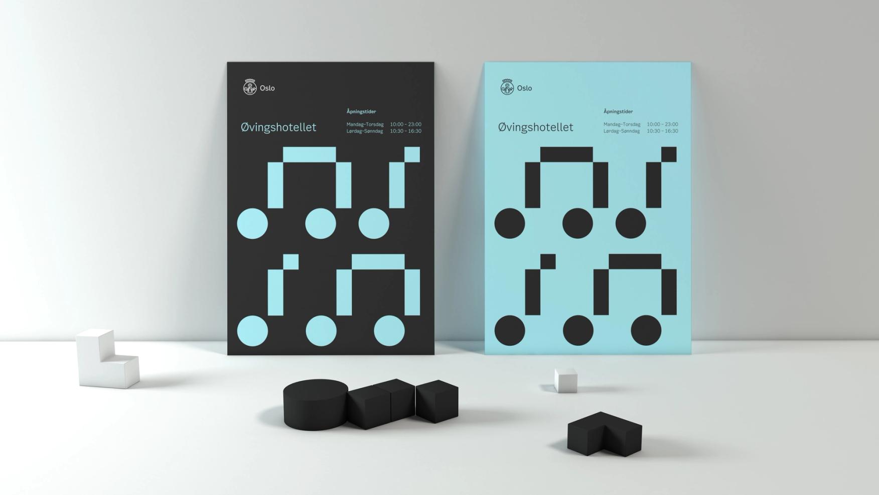
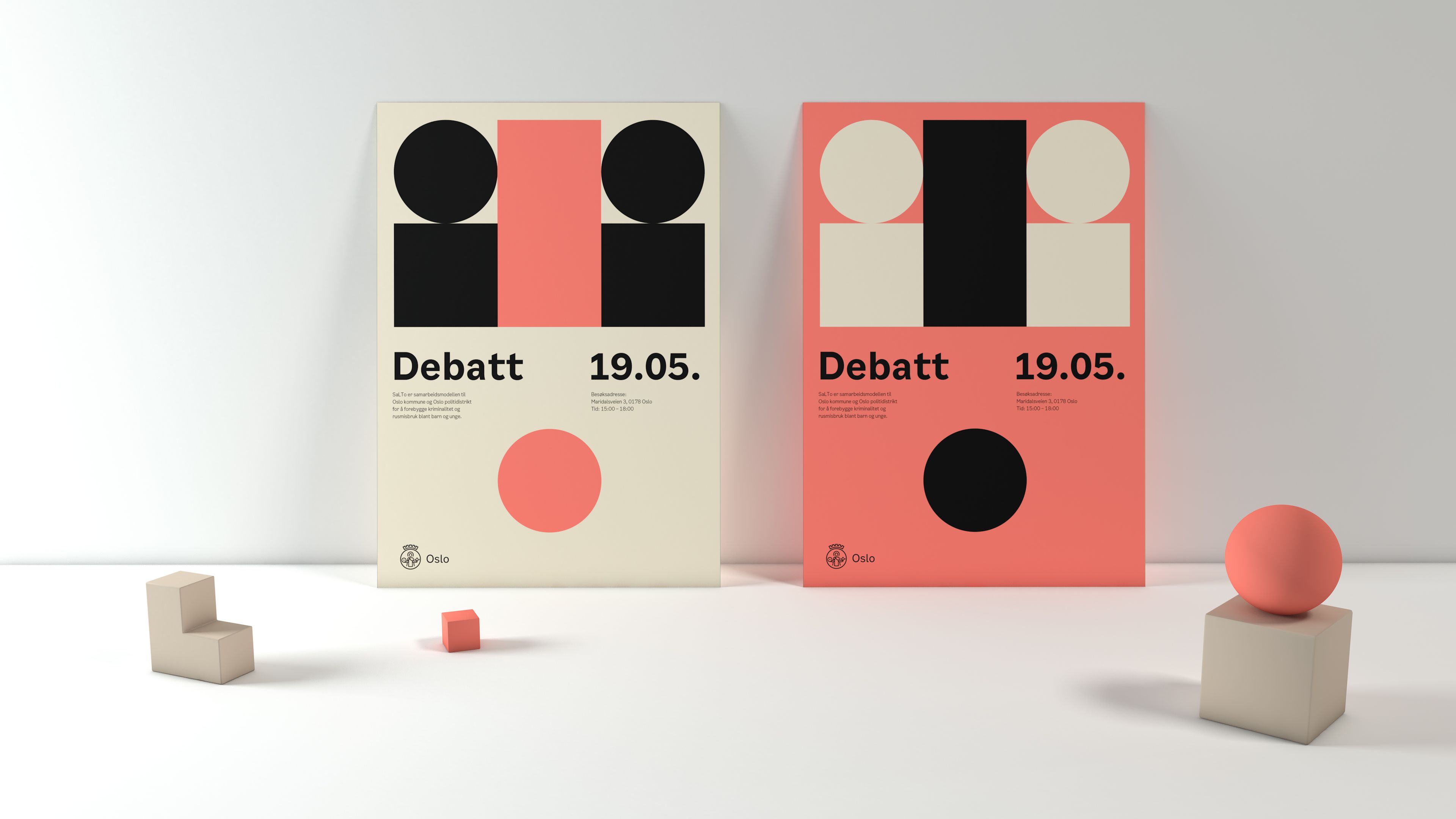
From sober, authoritative communication to a lighthearted, playful style – and everything in between – the design opens for a full range of expression. The new visual identity is unified while simultaneously allowing flexibility in communication. Combining uniformity and flexibility ensures that municipal enterprises can easily apply the new identity while making it their own.
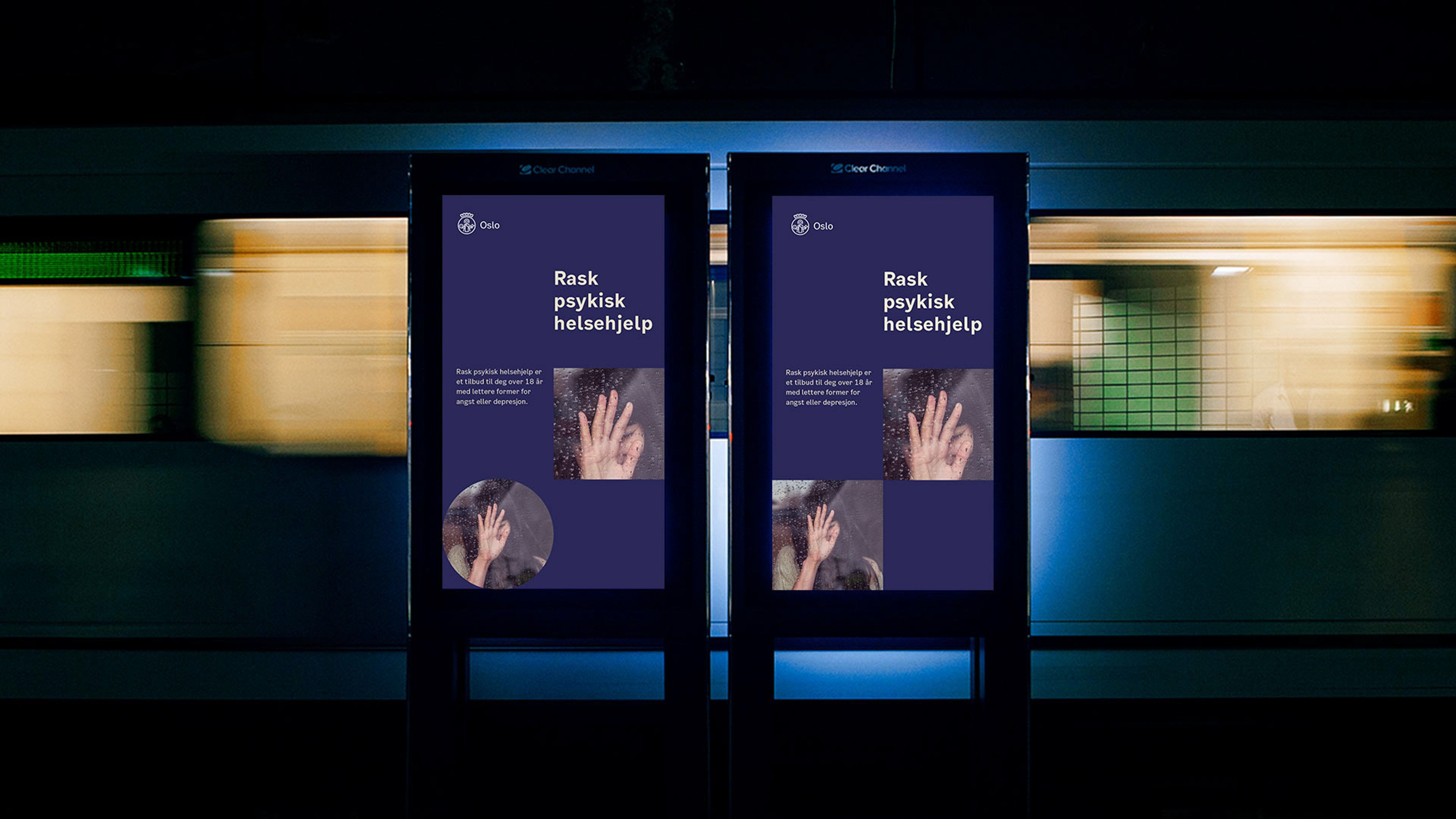
We created the Oslo digital design assistant to reduce the barriers and costs of good design. Any City of Oslo agency employee can log into the online tool, input basic information, and have the device automatically generate a range of design layouts and options.
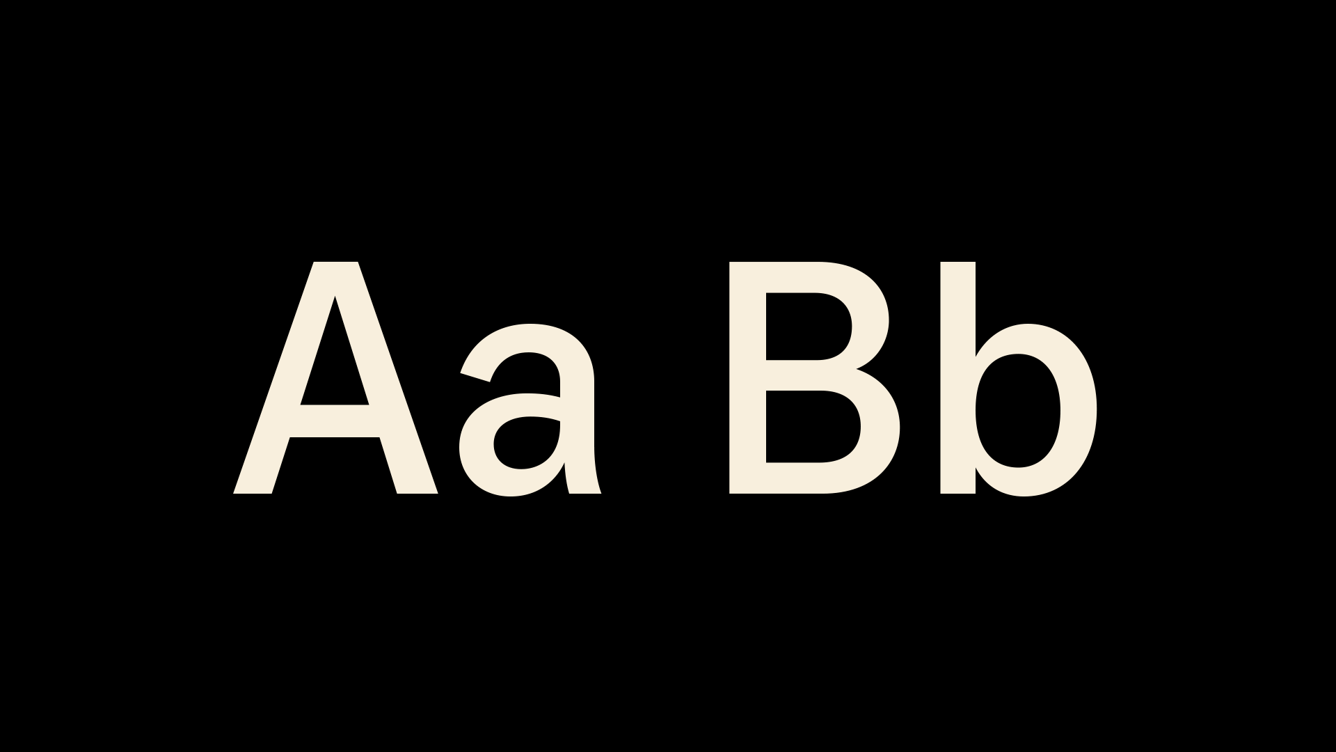
We developed Oslo Sans, a bespoke typeface for the project. Many generations of street signs in Oslo inspire Oslo Sans. The font adheres to universal design principles and is made with a utilitarian focus aiming to be functional and timeless yet distinct enough to be recognized.
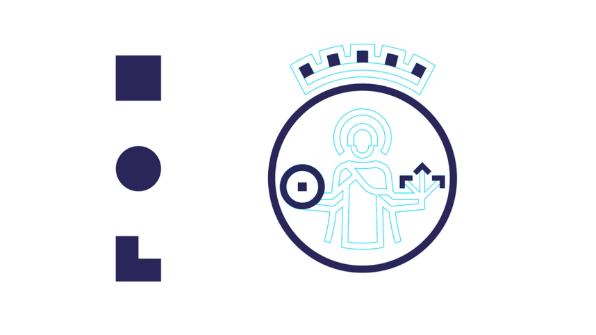
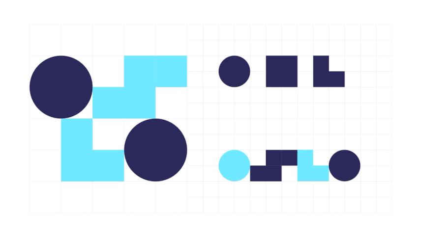
The shapes, a result of forms found inside the symbol, abstractly refer to bodies often found in the cityscape. The three basic shapes may be assembled in infinite ways and are the essential components of the design system.
The identity colours are taken from Oslo's cityscape: blue from the iconic Oslo trams and the fjord; green from the parks, fields and Oslo's protected forests; warm and neutral colours inspired by the facades of the city's buildings.
Movement is also a central part of Oslo's identity. A dynamic motion pattern is defined, making the identity easily recognisable in various media formats.